Classify by Value 1: Areas
You can use Classify by Value (on the Data Menu) to assign areas to groups (strata), based on the value of a variable.
Let's say you want to map per capita income by state. From the Data menu, you'll choose "Classify by Value", and then you'll do three required things.
Three first steps in Classify by Value
- Select the map Layer
- Specify the objects on that layer to classify
- Specify the grouping variable used to create the grouping
We will illustrate these steps with an example, then discuss Strata Manager options, including color customization, and how to enter the criteria for different stratification cuts, including custom strata.
In other words, you will be able to modify stratification and coloring, before you press "Assign".
After the stratification is created and showing on the map, you can still change legend names and map colors both with the Group Manager (found on the Groups menu), and by editing the group legend directly.
Now, let us proceed to the step by step example.
Classify by Value
Suppose you want to show states, classified by per capita income.
You would
- Select the states layer,
- Choose "All roster objects", which is the term used for "all of the objects, including even those that are not on the map" (such as Alaska and Hawaii in this instance).
- On the next dialog page, select the grouping variable "per capita income".
- Make adjustments in stratification range and coloring.
- Press "Assign".
Choose "Classify by Value..." on the Data menu:
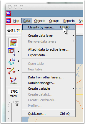
"Classify by value" on the "Data" menu
The Classify by Value dialog appears (SHOWN BELOW).
Notice the instructions at the top of the dialog. All Scan/US Dialogs have instructions.
Here, they are: "Assign selected objects to groups by the value or range of values of a data variable. Assign all objects or those selected by group or individually."
This helps you know, by reading it, that you have got the right dialog.
The first thing you need to do in this dialog is choose the source layer: States. If you are on the states layer when you start the dialog, "States" is already filled in as shown below. If not, you will have to scroll through the dropdown and pick it.
Notice (RED ARROW BELOW) there are two options in the list for states, (1:100T and 1:500T). These are just two renditions of the 50 states (plus DC) layer. They are the same basic idea. To make life easier for yourself, pick the one that is in the map, 1:500T.
There are also two columns of "radio buttons", from which you will choose the "selected objects". The one to pick here is in the right-hand column: "All roster objects" (RED BOX BELOW). "All roster objects" is the technical term for "all objects on the layer," in this case all states, including two that are not on this particular map. (Alaska and Hawaii).
Here is an an implication of the "all roster objects" option: you can make a thematic stratification that applies to the whole country. Then, later, you can apply (load) that national grouping into any smaller study area. A consequence is that when it comes to name the stratification you are creating, you should take the time to give it a good name. In particular, if it only applies to a local area, you should say which area it applies to. Then, when you want to load it later on, you will have a much better chance of finding the right one. Otherwise, you will be stuck loading a stratification that applies to some other local area, and nothing will appear, and you will be stumped. So, help your future self out by giving the stratification a good name.
Finally, notice a number showing "Total Objects to group", in this case 51 (RED CIRCLE BELOW). If you pay attention to this number, you will have additional confirmation that you are doing the right thing in the right place, with the right number of objects on the correct layer. If "Total Objects to group" says, for instance "1", and you are trying to group all the ZIP codes in Illinois, the "1" is a clue to you that you may not be on the ZIP layer. So, get in the habit of checking the "Total Objects to group" readout.
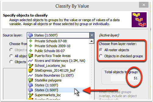
Specify objects to classify by choosing source layer
The completed dialog looks like this: (SHOWN BELOW).
At this point you can Click "Next" to proceed to the next panel, and specify the grouping variable.
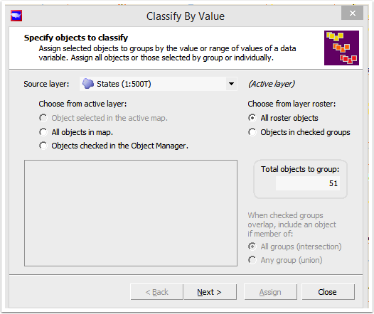
Specify objects to classify by choosing source layer
To specify the grouping variable (SHOWN BELOW) you scroll through the list of all available variables until you find the one you need. A "Plus" sign indicates that you can expand the list to see more options. The triangle next to each pound sign (#) is a button that opens another line to choose the "percent" option.
The pound sign indicates the variable is a 'count' variable, and could therefore be a percent of something. Thus, for example, you can make a thematic map showing the percentage of Hispanic population, or the count of Hispanic population, by choosing the count (#) or percent (%) variable after clicking the little triangle to expand and see both of them.
The variable we pick here, per capita income, is a "stat" variable, so count or percent do not apply.
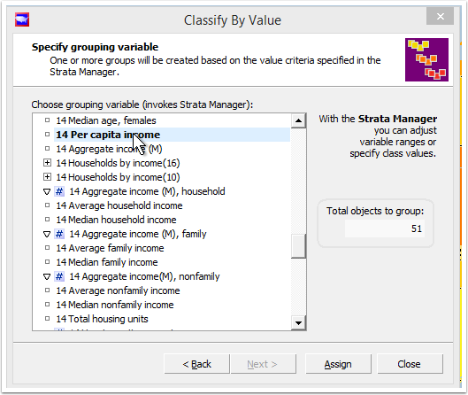
Specify the grouping variable: 2014 Per capita income
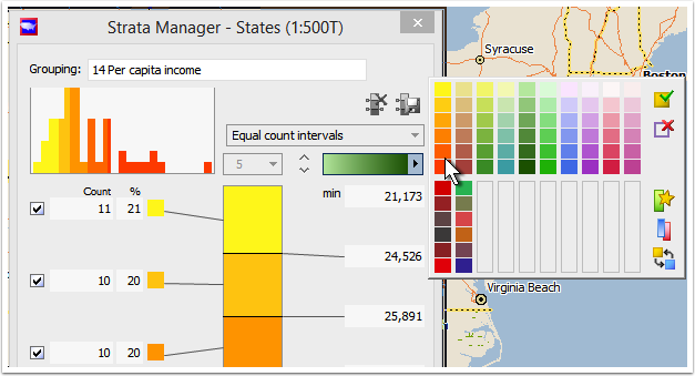
Strata Manager
When you select a grouping variable, Strata Manager starts. It appears to the right. It takes the distribution of the variable you select, and divides it into ranges. The default is five ranges (quintiles), but you can change this. The next three panels (SHOWN BELOW) show three different strata arrangements, based on the same distribution of "per capita income" values, per state.
In the upper left-hand corner of the strata manager is a HISTOGRAM (RED RECTANGLE BELOW) of the distribution. You can see by comparing the histograms of these three different stratifications, that the distribution has the same shape, but it is colored differently, as states are assigned to different categories based on different strata limits.
The three types of stratification shown here are "Equal Count Intervals," "Equal Width Intervals," and "Standard Deviation Intervals". There is a fourth type of stratification, "Cumulated Value Percentile", which we will cover later. It is similar to Equal Count, so once you understand Equal Count, you are well on your way to understanding Cumulated Value Percentile, which we can call "Percentile" for short.
- Equal Count Intervals
- Equal Width Intervals
Standard Deviation Intervals
- Cumulated Value Percentile
Custom (you edit)
Let's start with Equal count intervals.
Here the criterion is "number of objects in the bin" (where bin is the stratum range). The yellow-highlighted columns below show the COUNT and the PERCENTAGE of the objects in each range. Each range, or 'quintile', has roughly the same number of objects. Thus, there are ten states where the per capita income falls between $30,759 and $44,162, and they are colored dark green. By looking at the histogram, you can see their distribution.
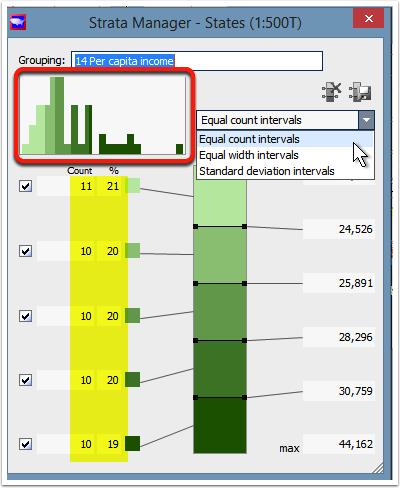
Strata based on equal counts of OBJECTS in each range
In the next panel, the strata manager shows ranges created based on a different criterion: "equal width intervals" representing an equal value distance between one range criterion and the next. Here it is roughly $4,500.
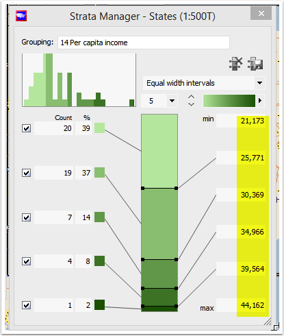
Strata based on an equal VALUE RANGE for each range
The next panel is the strata manager showing the same distribution (as you can see from the shape of the histogram), but just colored in differently.
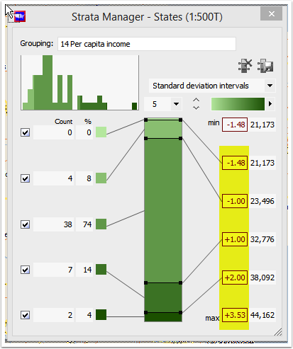
Strata based on STANDARD DEVIATION for each range
The standard deviation is a statistic that shows the spread of a particular distribution. Here is a graph that shows a standard bell-shaped curve, also known as a normal distribution or "Gaussian" distribution. The standard deviation numbers are the numbers along the bottom ... ranging from -4 on the left to 4 on the right. The mean value in this graph is zero.
As you can see, most of the values fall in the middle, between plus and minus one standard deviation. And most of the rest fall between two standard deviations. 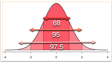
The shape above shows the "normal curve", where the darkest red area (center) is within one standard deviation of the mean, the lighter area is within two standard deviations, and the lightest area is three standard deviations from the mean.
You won't need to know this to operate Scan/US, but the rule of thumb for a distribution like this one is something called the "Empirical Rule": 68 percent of the cases fall within 1 standard deviation on either side of the middle, 95 percent fall within two, and 97.5 percent of the cases fall within three standard deviations of the mean. You can see there is just a tiny portion that falls between 2 and 3 on the graph above, about 1.25 percent on either side.
As you can see by looking at this particular histogram in the Scan/US Strata Manager, that distribution bears a faint similarity to this normal curve. Other distributions will not look like this at all, and so you would use something else besides standard deviation intervals to look at their stratifications.
At this point, you could click "Assign" and your five groups will be formed.
But instead, let's continue on and show some color customizations.
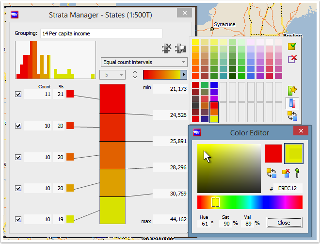
Different criteria can be used to split the objects into value ranges. We are going to edit one of the ranges, so for us it will say "custom intervals". The numbers on the left of the colors are the object counts in the category, and the numbers on the right are the limit numbers for the range. You can edit fields in either column.
Click the color ramp dropdown to choose a different color range
Notice the arrow below, clicking the "split range" button. This splits the color ramp in half so you can set a separate ramp for each range. You don't have to do this, you can have just one color ramp (and for the most part it makes better maps to have just one color ramp). The "star" button above it lets you set the selected ramp as your "favorite" or "default" color ramp. It will be selected each time you open Strata manager. The button at the bottom right, below the "split color range" button reverses the color ramp to go in the other direction.
How to make a split color ramp
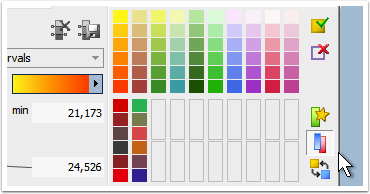
Click the "split range" button to make TWO color ranges
After you have "split your range", choose a half-range to begin with. Click on the range rectangle. Note: if you are just making a one-ramp range, then select the rectangle to work on ... it just won't be a half-range.
When you click on the range rectangle, the Color Editor dialog will pop up, as shown below:
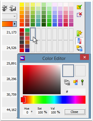
Click one half-range first, and then choose the two color end-points
Move the color slider (the small rectangle in the 'ramp rainbow' area of the Color Editor dialog) to the beginning color, and click in the color well. The starting ramp rectangle will fill in with the color, and the focus will move automatically to the ending ramp rectangle. Move the color slider to the ending color, and click in the color well. You are done with the 1st of 2 ramps. Click close on the Color Editor.
Click one color, then move the slider to the second color and click that one
Now you're done with the first half-range (SHOWN ABOVE).
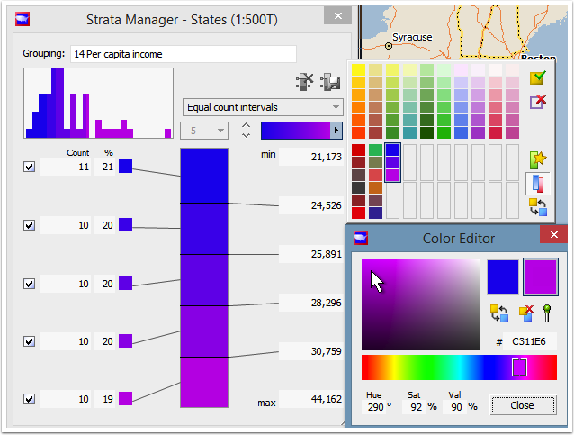
Click the other half-range (SHOWN BELOW), and use the same method to choose the two endpoints for the color ramp.
When you are done, click "Close" on the Color Editor, your dual-ramp ramps will be created. Note: although you can create ramps this way, half-ramps cannot be edited after they are merged into a full-ramp.
Notice the Strata manager color well only shows one ramp while you are editing
Now, you can choose your new custom color ramp by clicking on it, as shown below:
Note that a colored bar appears between each pair of ranges in the color well in Strata Manager. You can click on these and drag the dividers to change the size of the ranges. Also, you can edit the numbers on the min-max side directly. If you need to do this, this is the correct place to change the values, since when you change them here, the strata will adjust accordingly.
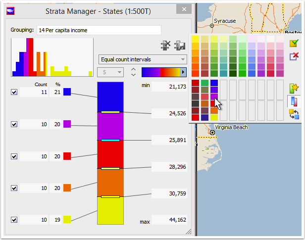
Finally, click on your range to select it
When you have done two ramps in a single grouping, having an even number of ranges makes sense. Where you see the '5' in the dropdown below, click that, and change it to a number with an even number, such as (shown below) 8. By the way, if you are doing category-coloring with only 4 categories, these two ramps will give you a way to specify four unique colors. In other words, choosing a '4' here would have the endpoint color of each ramp its own stratum color.
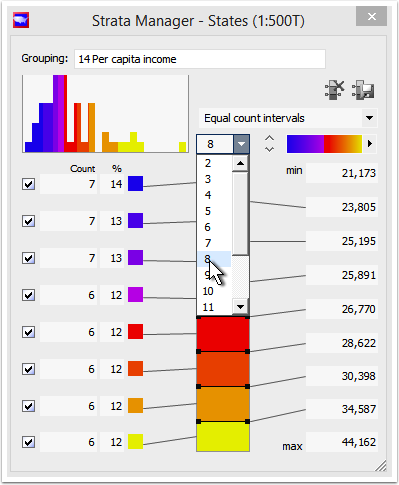
For two color ramps, having an even number of ranges makes sense
Another example: Cumulated Value Percentile
Let's look at another example, which only appears for non-stat variables: the Cumulated Value Percentile. Cumulated Value Percentile sorts ranges into ranges holding equal percentages of the total, with the highest numbers at the high end. Thus, in the example below, just three states make up 20 percent of the population, and those states are the most populous. This stratification is also good where you want to look at, for example, the top-producing ZIP codes in your database.
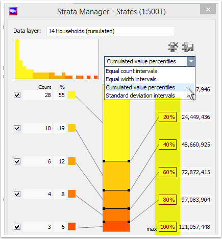
Cumulated Value Percentile sorts ranges into equal percentiles
After making this distribution, we will go through the steps of customizing the legend of the resulting map.
Click "Assign", and your groups are formed. The map is colored in.
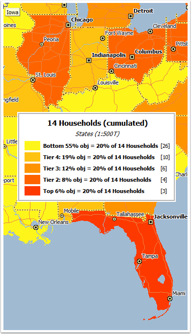
The legend shows the percentage of objects in each percentile tier
Grouping legend customizations
Let's change the legend to show "state" instead of the much more generic "obj". You can open the Group Manager dialog from the groups menu. Any changes you make in the group manager will 1) Cause your group to be auto-saved from here on in and 2) propagate down into the map's group legend, which is redrawn from the group information the next time you use it.
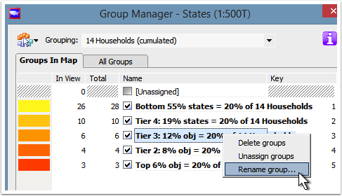
To change the legend, open the Group Manager and right-click the range
When you right-click the name of the group (shown above), the Rename Group dialog appears, and you can make your change.
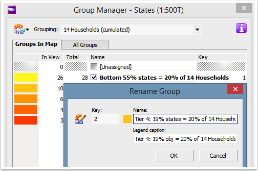
You can rename the group, and your changes will go into the legend
Now that we have renamed the groups, let's also change the groupING name. Currently it reads "cumulated", so let's change that to "percentile". The groups dialog reads grouping names, but to change them, there is a menu entry on the groups menu: "Rename grouping..."
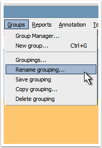
Rename the grouping to change the legend header
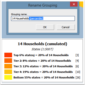
"Rename Grouping" dialog
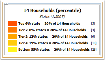
Legend showing change in grouping name
Here is your completed map of 2014 households, which has the order of the strata reversed from how it appeared in the Strata Manager, and how it appears in the group manager.
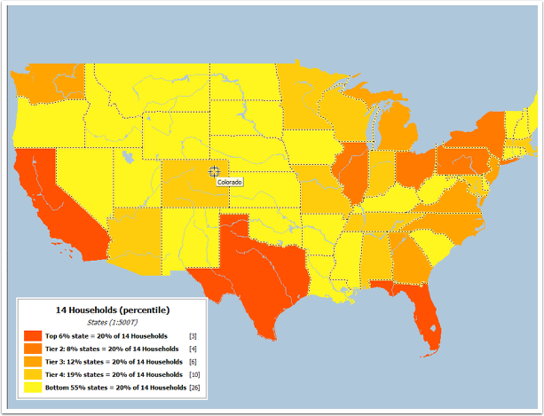
Here's your map of 2014 households by state
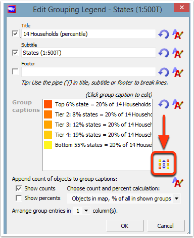
It's not possible to reverse the order of strata in these two location: you need to right-click on the grouping legend, choose "Edit Legend", and when the "Edit Grouping Legend" dialog appears, click on the "reverse legend order" button. (INDICATED BY RED ARROW BELOW). The order of strata in the legend will reverse.
Here's your map of 2014 households by state
Notice there are also several other checkboxes you can hit, to govern whether title, subtitle, counts, percentages, what the percentages mean, and number of columns all appear in the legend. These settings are not saved when you save your study area.
Show/Hide groups on layer
There's one final note about groupings. The "hide/show" button at lower left of the map.
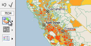
Show/Hide groupings buttons shows the active grouping.
The button is called "Show/Hide groups on layer", and is located at the left side of the Scan/US map, either in the middle of the screen or near the bottom, depending upon how tall your monitor is. The small triangle to the right of this is a built-in menu which will show all the groupings you can load onto the current layer. The same list of groupings will also appear at the bottom of the groups menu up above the map area of Scan/US.
This concludes our survey of Classify by Value, area objects.
It is also possible to use Classify by Value on location objects, in which case the stratification options are somewhat different. ---