How to customize map layers
In this exercise, you will create a map with county boundaries for just three counties, and then customize the borders, labels, and appearance of the counties. Then, in the same map, you will do the same thing with census tracts.
Make a study area
It's always a good idea to begin by making a study area you're going to work in. This is especially true when you're working with smaller geographies like block groups, grids, or ZIP+4's (Z9's), but it's also true when you're working with census tracts and counties. It can make the list of objects that you're trying to customize a lot smaller and easier to deal with in the ScanUS Object Manager.
You can make a study area by selecting framing mode
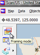
Click the framing mode button to draw an area for new study area
and drawing a framing rectangle in the map at the point you want to see a closer view. (see below) After you draw the rectangle you can move it around so it's exactly where you think you want to be. Above the rectangle three little gizmos will appear. They are, from left to right: the height of new area in miles, a symbol with the tiny red starburst, and a magnifying glass with a 'plus' in it. The 'plus' symbol will zoom you into the map, but the zooming will not create a new study area. Therefore, you should choose the red starburst icon to create the new study area.
create a study area by clicking the middle one, above the rectangle
You will have an opportunity to name your study area and select a theme. We are not showing the box, because it is completely obvious. At this point you can name it anything you want and choose whatever theme from the theme drop-down. If you have saved a theme previously, this is where you will select your own custom theme. Then, click the "Create" button in the New Study Area dialog to create your new study area. In this example we have created the study area centered roughly on Allentown Pennsylvania between Allentown and Scranton. From the Map Menu, open the Map Layers dialog, in order to see what layers are in the map, and to prepare for adding new layers.
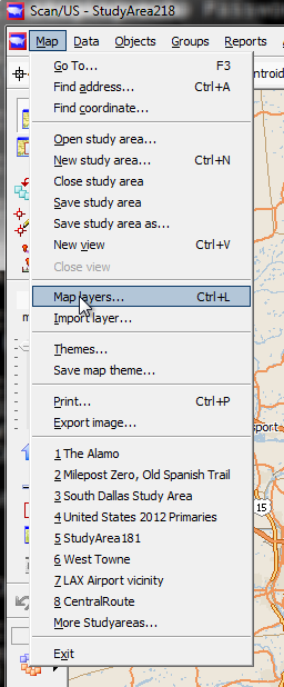
Choose 'Map layers' from the Map menu
Now that you have opened the map layers box, lets take a tour of it in its present form. It has the ability to expand and contract, showing you just the most-frequently used map layers, or showing you every single marking that appears in the map, which is called " reference cartography". Most of the time you will not be concerned with controlling the reference cartography, but in this instance, we are going to use this list to hidethe street layer and other aspects of the map.
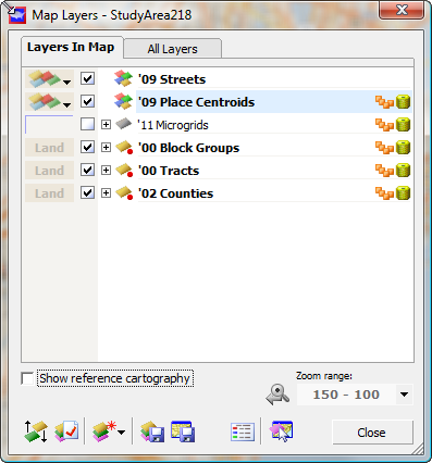
See what is in the current map, or add to it from the "All Layers" tab
In fact, now is a great time to check the checkbox next to the phrase "show reference cartography" and observe more layers appear in the list. Each layer has a checkbox next to it: you should un-check the boxes next to '09 Streets , '09 Water Bodies and Urban Areas. As you do, notice these layers disappear from the map. Un-check the "show reference cartography" checkbox again to simplify choosing layers. Since we are not going to be using block groups in this exercise, you can uncheck the block group layer as well. You should have a map, and a map layers box, that look like this:
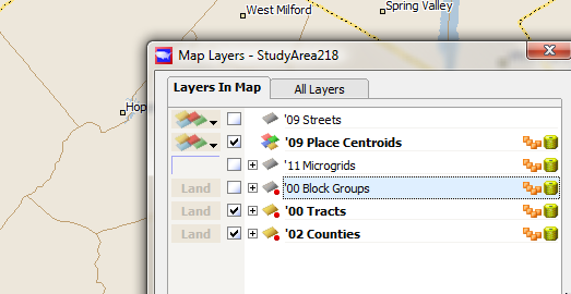
Uncheck boxes to make layers disappear from the map.
Before we customize this map, take a look at the symbols to the right of each of layer, with the exception of Streets. There is a group of four little orange page icons, and a yellowish cylinder. The "four pages" indicate that there is a grouping present on the layer, and the cylinder indicates that data is present for objects on the layer. To the left of each layer name, between the checkbox and the name of the layer, is a "+" sign in a square, and what we call a little dingbat, for want of a better name. The dingbat is a representation of some fact about the layer. For example, the layer is grey when it is not contained in the map. A red dot underneath the layer indicates that it is a "Land" layer, providing complete coverage of the land underneath. The "+" sign is a teeny-tiny button which, when you push it, expands to show further options, underneath that particular layer, related to controlling the display of the layer. Since we're going to be working with counties first, click the "+" next to counties, and you'll see object labels with a checkbox next to it. Click the checkbox, and the county names will appear in each county, or at least most of them.
Before we proceed, let's change the way County labels are shown. The leftmost column in the map layers dialog is a column of buttons which, when you press them, bring up style selectors. Depending upon which type of layer you select, you will be able to select label style, line style, border style, area style, or symbol style. Press the "AaBbCc" button next to County object labels and notice that the label style box for '02 Counties has two tabs at the top: "Format", and "Content". At the bottom, an "Apply" button appears gray but you will be able to push it as soon as you make any change in the format or content of the label style. So choose a different font perhaps a 12 point font and, if you wish, a different font face. The "Format" tab is not shown since it is fairly obvous.
Then click the "Content" tab, and noticed that you have four formats in which the county name and County code can be displayed. For the moment choose County code plus name.
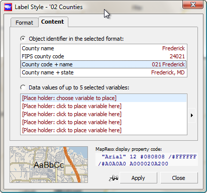
Customize label formatting on the 'content' tab:
The middle panel in this box lets you select a demographic variable to display for each county by pressing the radio button for "Data values up to .." and then choosing a variable using the small extending-menu triangle button at the right of the list of five 'Place holder' variables. We are not going to do that in this exercise but keep in mind that it is possible. Instead, click "Apply", and notice the county codes and names appear in the map. This map is centered on Lackawanna, Monroe, and Carbon counties, and now you can see the county names. Our next step will be to select these three counties as the focus for our map.
We have already covered single object selection in which "Select object mode" is used to select a single object in the map. Single object selection is transitory: as soon as you select another object, the selection of the first object goes away as the new object is selected. In order to provide a more-permanent way to select objects so you can work on them (and for data totals to be accumulated and shown), Scan/US has a group mode with four grouping sub-modes. Activate group mode by clicking on the third button down in the left-hand control panel.
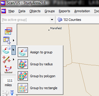
Group assignment submodes
Choose the first option, "assign to group", and double-click on County 069, Lackawanna. The "New Group" box will appear and you will name your group according to whatever you want to see in the map legend. We are going to call the group "Assessment Area 12". The salmon colored panel in the upper right corner of the box is a button which opens the area style selector for groups. However, we are not going to change the group color in this exercise. You can also change the grouping name, and before we click "OK", we are going to type in a new name for the grouping. What is a grouping? A grouping is a collection of groups -- it's very useful for comparing groups.
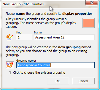
Choose good names for groups and groupings
Next, double-click inside Monroe County and Carbon County, and notice that they are colored in with the salmon grouping color.
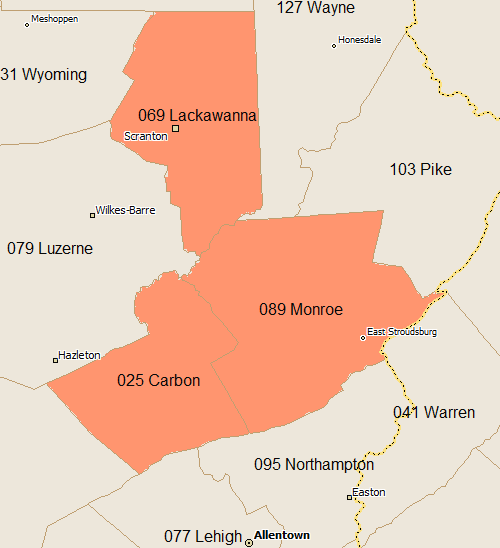
Three grouped counties, showing county codes
Now that we have our group, we can customize the appearance of the map. Click the button next to counties in the map layers box, that says "land". You will see the area style selector for counties showing a variety of different border line styles. Click a thicker "dashed" line style, and choose a different foreground color by clicking the jagged-line button to the right of the foreground color indicator, choosing the color, (we are picking purple),.
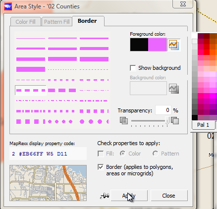
Customising the area border style
Now click "Apply". If you don't like what you see, go back and choose a different style. Now that you have applied a line style to the counties, from the Groups menu choose Group Manager... The Group Manager will show your group, however you have named it, with a count of three objects in the groups.
At the bottom of the group manager box, shown below, you'll see a panel of about 12 buttons and some readouts. it will say "Objects: 3", "Groups:1, and so forth.
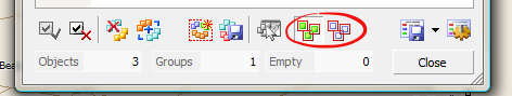
Bottom panel of Group Manager box
The pair of push-buttons showing three-object renditions (circled in red above) can be used to toggle the drawing of borders inside your group (left button), and outside your group (right button).
Labeling
Now that we have labels turned on and lines showing on the counties we want to have hightlighted, let's take an excursion into the label control, before we return to census tracts and their line and label customization.
There are two ways to customize labels. First, you can work on them by direct action. That is, in select mode you can select an object, right-click, get the context menu, show or hide the label as desired, and change the label style for that one object. If you want to move an existing label, repositioning it by hand, choose the Select label "sub mode" by clicking the triangle menu next to the select object button (shown below), and choose "select label". You'll see that you are in select label sub on by the fact that there is a lower case letter "A" in that button
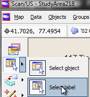
Select label submode
Now, when you click on a label in the map, you will be able to reposition it by draging it to a different location. The position of the object itself cannot be changed: just the label.
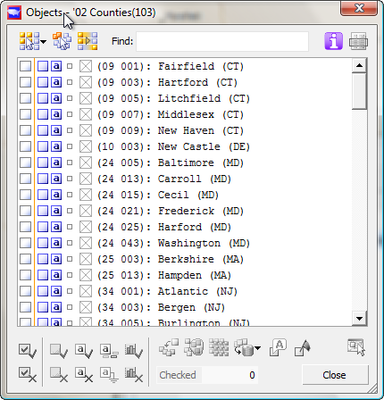
Still, to make all of these labels disappear one-by-one would be a lot of work. In order to mass-disappear them we need to make a visit to Object Manager. From the Objects menu choose Object Manager. It will come up and say "Objects -- counties(103)". The number in parentheses is the number of counties in the map. A list of counties will appear with empty check boxes at the far left. The X-in-a-box column represents group assignment.
Two panels of controls are shown: * The panel above the list relates to selection. * The panel below the list relates to action on the checked objects.
It looks complicated, but once you use it, it's not. It simplies life considerably, compared to selecting and acting one-by-one..
check selected (red), act on checked (blue), select in map(green)
The two boxes circled in red (above) are used to check off selected items in the Object Manager list.
The three pairs of boxes in the blue rectangle (above) are used to control, from left to right object visibility, label visibility, and whether a label is manual or not. A label under manual control always appears in the map, while a label subject to automatic placement may or may not appear, depending upon other labels nearby.
The green arrow (above) points to a button which will, when an object is selected in the list, will select that object in the map.
Our strategy will be to
- first select the three counties in the group
- then invert the selection
- then check the checkboxes of all the non-grouped objects by clicking the green check in the lower left of object manager.
- With the desired counties checked, the second step will be to make the labels go away by clicking the red X next to the little a in the lower panel (shown within the blue box above -- note; the blue box does not appear in Scan/US -- only in this diagram.)
First, click the "select objects" menu in the object manager and choose "unassigned objects", which you'll find directly underneath "grouped objects". Doing this makes it un-necessary to "invert" the selection.
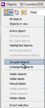
Choose 'grouped objects' from Object Manager selection menu
You will see the names of the counties appear on any background which is now blue(indicating selection in Object Manager), with the exception of the three counties in your group. Your three counties will have a salmon colored square next to the county code, and the background will not be highlighted, because they are not selected. In the lower left pair of boxes click the one with the green checkbox, and checks will appear for all the selected counties.
At the same time, the checkbox underneath the green checkbox will highlight: it will have a red X. across it. Use this box if you want to uncheck the objects — but not now!
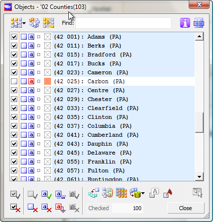
Object Manager with ungrouped objects selected
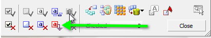
Direct your attention to the square with the lower-case 'a', and a red X on it (shown below). This is where we will make the labels disappear. Click the red 'x' next to the little lowercase 'a', as shown below.
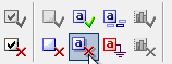
'action panel' at bottom left of Object Manager
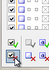
You can see now, in the map, that all the county labels have disappeared, except for the names of your three grouped counties. To bring the labels back for the checked objects, the green checkbox above the red checkbox you just clicked is the one to press.
It might not be the case in your map — our zoom levels may be different, or you may have selected a smaller font for your counties — but in my map no label appears for Lackawanna County. This is because the label for Scranton is getting in there first. It displaces the county label. There are two ways to solve this and cause the county label to appear. One way is to make the Scranton label disappear, or move it so that there is room for 069 Lackawanna to show up. In other words, to try and work around the automatic label placement system. This is a little tricky though, because there is no guarantee that the label will show up, or stay there once you have gotten the label to pop up. The other way is, right here in Object Manager, to make the labels in the group "manual" labels. And that's pretty easy once the correct set of objects (our three counties) is checked. You need to uncheck the non-grouped objects and then re check the grouped objects.
First, from the object manager selection menu choose "all objects", at the top, then click the X. check select button lower left. This will un-check all objects.
uncheck selected objects in Object Manager
With all objects un-checked now choose grouped objects from the object manager selection menu (top left menu within Object Manager) and, with those 3 selected, check those objects, using the green checkbox at lower left of Object Manager.
The next image shows where to make labels manual: pressing the lower-case "a" button (green arrow below:)
Object Manager lower panel, showing label manual control
Now the little red 'a'-in-a-box (shown with green arrow above) and you will see 069 Lackawanna appear in your map.
Census tracts
Now we have three counties labeled the way we would like. Let's add lines for Census tracts.
We can anticipate that we would like to do the same thing with the tracts that we did with the counties.
We would like to group the tracts.
Because we already have a group of counties in the area of interest, we can go ahead and create a census tract grouping from our County group, saving the time of grouping the tracks manually. And, we'll also get a chance to demonstrate the "show/hide groups" button in the left panel of Scan US.
From the Groups menu choose group by object. the group by object dialog will appear, and in this box you will see that your overlay layer is the current layer 02 counties, which is correct, and that you have two columns to choose from. You will be choosing from a column that says "Choose from layer roster ". Underneath it will say "Objects in checked groups" which you will click. You will see your group Pennsylvania counties and you will check that. It will say Total overlay objects: three. Your dialog box should look like this:
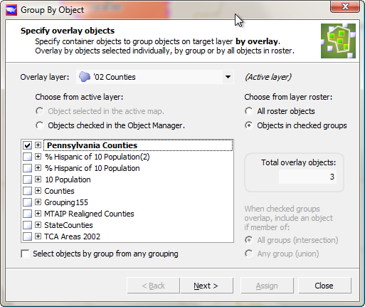
Group by Object PA counties
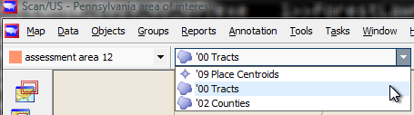
Click "Next". Here you will specify the target layer. Click the drop-down and choose a census tracts. In this example picture we are going to use 00 tracks, but you might easily be using 2010 tracts by the time you see this example.
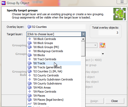
target layer: tracts
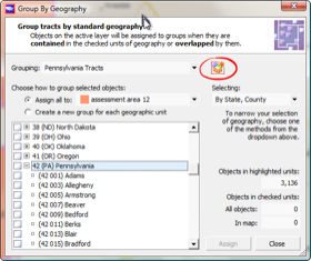
Here is a point at which you have to be careful. You do not simply want to click "Assign". Note: a grouping is already shown. You probably do not want to add to this existing grouping, changing it with your new objects.As an existing grouping, it probably has carefully defined characteristics, and this random addition would ruin that. Instead, press the funny looking starburst button to the right of the grouping name (white arrow pointing below) and click it to create a new grouping.
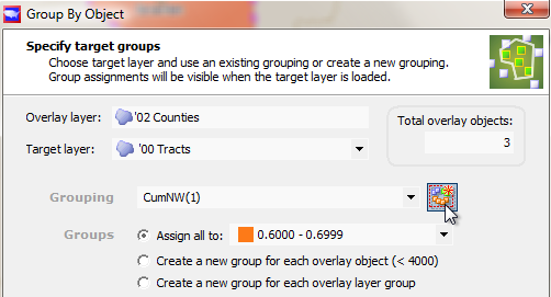
New grouping button icon
You will be presented with the new group box an opportunity to name your group and grouping. Give it a name: Assessment area 12, and the grouping name Pennsylvania tracts. Click "OK", and notice that it now says next to groups "Assign all to Assessment Area 12. There are some other options for assignment which you should take a look at in case you might want to use them in the future.
Click "Assign". It appears that nothing has happened, but is this true?
It's true. Why is it true? Group by Object is not implemented to be used for built-in Census layers. Oops! Sorry! For this you must use Group by Geography, and we will do so now.
Group by Geography
First, change to the Tract layer by the using the active layer drop-down:
Active Layer dropdown showing tracts
From the Group menu, choose "Group by geography".
If you do not see the grouping called "Pennsylvania tracts" in the grouping drop-down, click the create new grouping button (red circle below) and make a new group. Make sure you do this, and do not assign to whatever random group happens to be there.
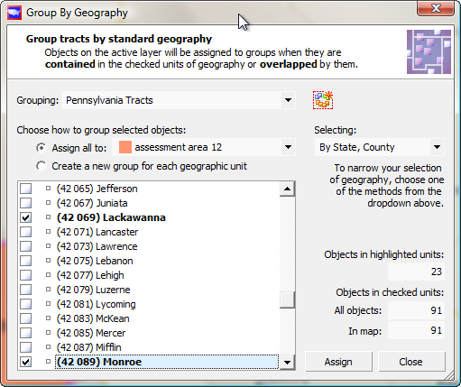
Underneath "selecting:" choose by state, county" and in the list below scroll down to Pennsylvania and expand by clicking the "plus" button next to the state.
Group by Geography, ready to select tracts by county
Scroll down so you can see Carbon County, then check it along with Lackawanna and Monroe. You will see under "Objects in checked units" at the lower right, there are 91 objects. This represents the number of census tracts in the three counties, while the "23" is the number of tracts in Monroe County, currently highlighted. Click "Assign" and the 91 tracts will be assigned to the new group. You can close the group by geography box.
Selecting counties
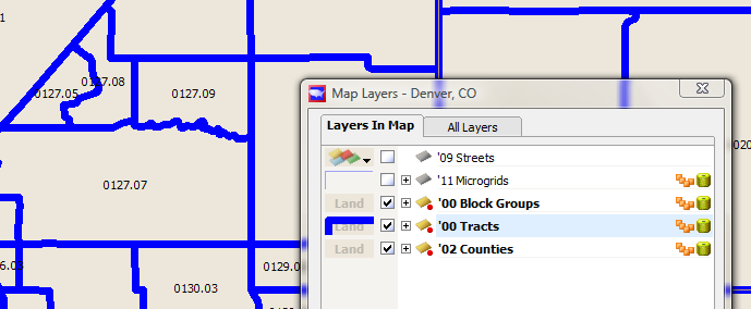
From the map menu choose "Map layers", and uncheck the box next to counties to make counties disappear (temporarily), so that you can see the grouping of tracts. Click the "Land" button next to tracts and change the border rendition of tracts so they are a blue line. You already know how to do this from having done the same thing with counties.
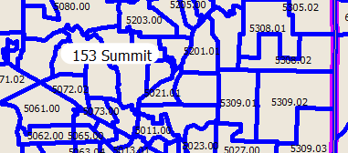
Tract boundaries showing Census tract codes
Next, activate the tract layer, call for tract layer labels to appear (using the Map Layers label checkbox next to tracts) and use Object Manager on the tract layer to:
- select the unassigned objects
- hide their labels
- hide their objects.
- select and check the grouped objects
- make the tract labels appear
- make the tract labels manual so they all appear
You know how to do this from using Object Manager and Map Layers label control on the counties layer.
Save a map theme
Now that you have the map looking the way you want, you can make it easier to make similar maps in the future. From the Map menu, choose "Save Map Theme", and give your map a memorable theme. I am going to name this one "counties-purples-tracts-blue-labels-on", and click OK.
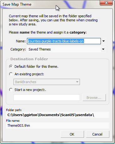
Save Map Theme, showing user-defined name
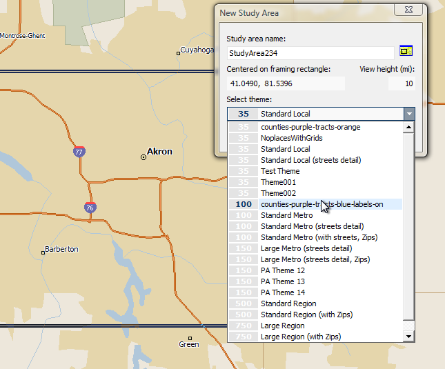
Then, when you make a new study area, you can choose the "Select theme" drop-down and choose your new theme. Notice that there are two similarly named themes in the image below, the 100-mile theme we just defined, and a 35-mile theme created earlier called "counties-purple-tracts-orange". You should be aware that when you are at 100-miles, the themes saved inside a 35-mile study area will not show up in the list. It is necessary to make a 100-mile theme with the display characteristics you desire.
Map of Akron showing interstates and hydrography
When you click "Create", your new study area will be created with the line and label characteristics you require.
Map of Akron showing tracts (blue) and counties (purple)