Multiple-Object Reports from Scan/US
There are several really powerful options in the Scan/US report facility. We will go through each one of these, and show you how to do it. Here is what we will be covering:
- Distance report: Choose "Export distance.." from the Objects menu.
- Thematic maps: Create thematic maps from the Data Menu., by choosing "Classify by Value..." Print maps from the Map menu, by choosing "Print..." or "Export image...".
- Comparison report: Choose "Comparison report" from the Reports menu.
- Benchmark report: Choose "Benchmark report.." from the Reports menu., choose "Site Express..", and enter your address, selected object (or objects), specify the number and size of rings or drivetimes, and choose the pre-formatted reports.
- Export data: all roster objects From the Data menu, choose "Export Data..", and choose "All roster objects on the first panel. Then select the precise set of demographic variables to export to an Excel workbook or other format data file.
- Data-labeled maps With your desired data layer active, choose "Label Style.." from the Tools menu, and click the "Content" tab. Click the button to the left of "data values" and choose up to 5 data values from the triangle menu.
These are actually not the only kinds of reports you can do in Scan/US -- these are just the ones which focus on relations between multiple objects. Quicklook reports, profile reports, Site Express, Export data, and map printing are covered in another overview document (which you have probably already read.)
Distance report
To illustrate the Scan/US distance report, we will produce a table showing the distance from a set of seven source objects to a group of over 500 destination objects. The source objects are the seven performance venues of the New Jersey Symphony Orchestra (NJSO), and the destination objects are all public schools within a ten-minute drive of the seven symphony concert locations.

Export distance creates a table of layer-to-layer distance values
First, choose "Export distance..." from the Objects menu (above), to get the first panel of "Export Distance," shown below.
The "From layer" is shown as NJSO locations. For the purpose of this example, we are assuming that you already know how to load in your own layer of objects. The NJSO layer, or a layer like it, could be created using Scan/US "Find Address" or "Find Coordinate" (both located on the Map Menu).
To get everything in one output file, choose "All roster objects", and distances will be calculated from all 7 of the "From" objects to all 571 of the "To" objects.
Click "Next" to select the "To" layer.

Choose the "from" objects:NJSO performance venues
To make the result more comprehensible, we did another pre-preparation that we're not showing step by step: we created a grouping of the schools that fell within a 10-minute driving time of the seven NJSO locations, excluding from the grouping any schools on the other side of the Hudson or Delaware River, in New York or Pennsylvania.

Choose the "to" objects: public schools within ten minutes
To include just those schools in the grouping, click "Objects in checked groups" underneath "Choose from layer roster," and select the group. Here, it is named Group001
Click "Next" to proceed to the "Create Distance File" panel, where you will name your file, and specify another output option.

Specify the output file, and options
The workbook output file has been named "NJSO-to-Schools-Distance.xlsx." It is an Excel Workbook of about 88.4KB (small), and the keys, if numeric only, would be prefixed by a pound sign (#). They are not numeric, so no "#" appears in the output file keys.
Two additional "filters" can be specified on output, and we have chosen one of them. Although a ten-minute drivetime brings in more people than a five-minute radius would, we have decided that we don't want to see any schools that are farther away than 6 miles. This way, only a couple of schools will appear more than once in the list, since they are within 6 miles of two of the performing venues. Therefore, we have checked off "limit by maximum distance", and entered a "6" for 6 miles.
After export, you can open the output file by clicking on the first blue link at the bottom of the "Create Distance file" panel. The workbook output is shown below:

Look at the distances
The spreadsheet shown above is the final product of "Export Distance". Each distance record has a unique key (shown in column 1 above), and also carries the key, name, and coordinates of the "to" and "from" point for that record. The "fun part" (shown in the red rectangle, above) is the distance "from point A to point B", and the compass heading of that distance, in other words, the direction in degrees. The red rectangle encloses distances and directions for schools within one mile of NJPAC, the New Jersey Performing Arts Center, in Newark.
If you wanted to load the distance data back into the schools layer, you would use the "key_to" column (circled in green above) as the key for import to the schools layer. Then, you would be able to export information about each school, such as pupils, students, the numbers of free lunch students, which are already in Scan/US, along with this distance data, all into one export spreadsheet, with data shown by school.
Thematic maps
Let's say you want to show a map of the population distribution of the Hispanic population, by ZIP code, in the United States. From the Data menu, choose "Classify by Value:"

"Classify by value" on the "Data" menu Is the path to the familiar "Strata manager"
The first thing you need to do is choose the source layer: ZIP Polygons.

Specify objects to classify by choosing source layer
Notice, above, the Source layer dropdown (red circle) can be used to select a different layer to make the group classification. We have chosen "All roster objects", in other words, all ZIP codes, and the Total objects to group (above) is shown as 41153. For ZIP codes, this number changes from year to year.
Click "Next" to proceed to the next panel, and specify the grouping variable.

Specify the grouping variable: Hispanic population
When you select a grouping variable, Strata Manager starts. It fills in the value for the distribution of this variable, Hispanic population, over the current source layer, ZIP codes:

Different kinds of strata criteria can be chosen
The next steps are optional and can be omitted. At this point, you can just click "Assign" and your five groups will be formed.
Different criteria can be used to split the ZIPs into value ranges. We are going to edit one of the ranges, so for us it will say "custom intervals". The numbers on the left of the colors are the object counts in the category, and the numbers on the right are the limit numbers for the range. You can edit fields in either column.

Outlying values can be excluded
Here, we have edited the bottom value: 1000. Furthermore, we have clicked the "low lock" to exclude any ZIP code with Hispanic pop less than 1000. Notice the lowest range un-checks. If you do it this way, a group will not be formed for that lowest range. Since you can cause a group to disappear later on, you may not do this often. Remember, it is optional to do this.
Now, click "Assign", and your groups are formed. Notice in that map, that since you do not have ZIP codes loaded, that nothing changes. Usually you will do this operation on a geographic layer which is already loaded, but you should know that you do not need to have it loaded in order to set up the groups. Of course, you must be able to see ZIP codes to see a map of what you have just done!
In order to see your thematic, you must either a) make a new study area, choosing a theme with ZIP codes in it or b) add ZIP codes to this map. There is not a "canned" map theme of national scope with ZIPs in it, so you will have to add them to this map. From the Map menu, choose Map Layers, click the "All Layers" tab at the top, scroll down to "Postal Geography", click the "+" sign to expand it, and click the checkbox next to Zip Polygons or Zip Centroids. Your checkbox should look like this:

Map layers dialog: adding ZIP polygons to the map.
As you can see by the green ZIP boundaries interlacing the map (above), the ZIPS have not yet been colored in. However, the group was created, and you can activate it by pressing one of the buttons at the lower-left of the Scan/US left-panel.

Show/Hide groupings buttons shows the active grouping.
The button is called "Show/Hide groups on layer", and is located at the left side of the Scan/US map, either in the middle of the screen or near the bottom, depending upon how tall your monitor is.
The number shown above the button is the number of objects (ZIPs in this case) in the active grouping (7034 total, in this case).

A legend appears at the same time you activate the grouping.
The grouping legend, which appears when you show your grouping, can be edited, if you wish: Right-click your mouse on the legend, and an "Edit grouping legend" box will appear, which is fairly self-explanatory, so we don't show it here. You can change the title, the sub-title, whether counts of objects appear and how they are expressed, and the number of columns in the grouping legend. The legend above shows the population range for each color, and in bracket parentheses the number of ZIP codes are in that range -- 2954 for the light orange-colored range with 1000 to 2625 Hispanic population per ZIP.
You can also change the appearance of the map, based on groups. From the Scan/US Groups menu, choose "Group Manager.." and look at the buttons at the bottom:

Buttons at the bottom of group manager can be used to hide or show borders
To hide the border on "unassigned" objects, click the button (above) to which the mouse-pointer is pointing. It is the one over which a little button pops up that says "Hide border on unassigned objects." The other button is to hide the border on assigned objects, that is, objects which have been assigned to a group.

The result of hiding ZIP borders
The map above shows four groups which do not cover all of the ZIP codes, since we left out all ZIP codes with a Hispanic population of less than 1000. Both buttons have been clicked to hide all borders, but they operate independently, so you have some selectivity.
The checkboxes within the group manager (shown above, checked in) will cause the group to disappear temporarily from the map (until you check them back in again), and the ranges shown can be renamed, and will remain with the grouping permanently, in whatever map you make based on this grouping. (This is not true of the legend which appears -- changes you make there do not become permanent to the grouping.)
The next map shows a different thematic, based on a completely different grouping:

You can choose a different thematic from the menu next to show/hide groupings
Next to the show/hide groupings button is a small "triangle menu" button. When you click it, a menu of the existing groupings on a layer extends, and you can choose a different thematic map to display, just by changing the active grouping.
Clearly, you can do much more with "Classify by Value" than we have shown here. You can change the ramp colors for the fill. You can select just some of the object inventory to classify, rather than the entire roster. You can choose different layers to classify on, such as MicroGrids, or Census Tracts, or States. You aren't limited to the demographic variables within the system, either. You can load your own data to a layer, and make a thematic map based on your data, or you can export data out, recombine it in Excel, and load it back in to make a map from it.
There are lots of possibilities.
Comparison report
Scan/US comparison reports facilitate the comparison of a series of objects, which can be specified in various ways, with one or two "fixed" objects, which appear on each page of the report. In other words, it is a three-column report, in which the first column varies, but the other two columns remain the same.
You can start with comparison reports by choosing "Comparison reports.." from the Scan/US Reports menu:
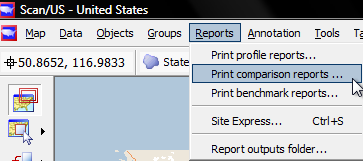
Comparison reports are reached from the "Reports" menu
To illustrate the capabilities of Scan/US comparison reports, we have done a small amount of preparation. Imagine that you work in marketing for the New York Philharmonic, and that you are having lunch with your friend who has the same job for the New Jersey Symphony Orchestra. You are principally familiar with the local New York audience, and don't know too much about the areas around the seven venues where the NJSO performs. Fortunately, however, you have Scan/US!
First, we have put down 5-mile ring around each of the 7 New Jersey locations. Data is automatically summarized for these rings. Second, we have made a group based on Census block groups located between 77th Street and 38th Street in Manhattan, a square roughly one mile in each direction from Carnegie Hall. Just over a quarter of a million people live in this area, which you know well.
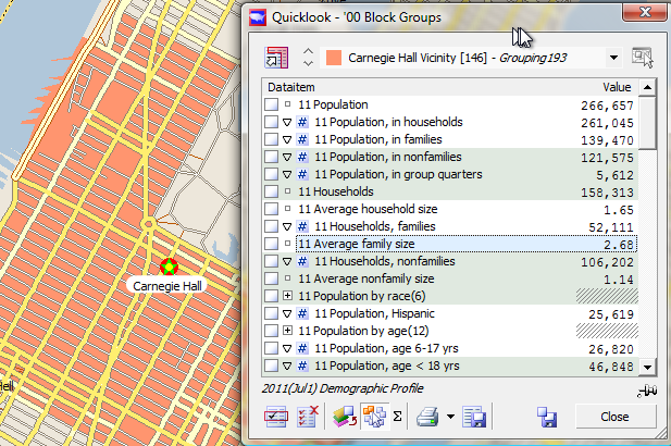
A geographic area centered on Carnegie Hall
With these two map enhancements in hand, we are ready to choose "Comparison reports.." from the Reports menu.
The first step is to choose the source object:
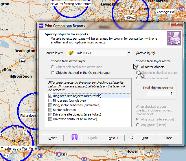
The source is the "compare objects" series, which changes from page to page
Your source layer will be the "5-mile NJSO" layer. Unlike Site Express, "Print Comparison reports" does not create your compare objects for you. You must have them already in hand.
Since we want comparisons for all seven locations, we choose the "All roster objects" option, (above right) and check "Ring Area site objects" (above middle left). Notice that "Total objects selected" is 7 objects. This is the correct number, so we click "Next", to proceed to the next step and select our report.

Press the dot-dot-dot button which appears next to the report
The only tricky part about this report is selecting the "fixed objects" for the report, which can only be done by pressing the "dot-dot-dot" button next to the report. This button only appears, however, when the report is selected. That is a Good Thing, because it means you will never select the button for the wrong report, waste a lot of time.
When you click the button, the "fixed objects" panel shoots out to the left.

Press the dot-dot-dot button which appears next to the report
The third-column (right-most) and second-column (middle) objects are selected by first: clicking in the proper field shown in the red rectangle (above left), choosing the source layer for the fixed object in the middle, and then choosing the object or group you want from the tabs at the bottom of the Fixed objects dialog extension.
If you make a mistake, or more to the point if you come back in and wish to do a different comparison report, you can press the "Clear" button to start over.
We will choose two fixed objects to compare: the State of New Jersey, and our previously defined area around Carnegie Hall.
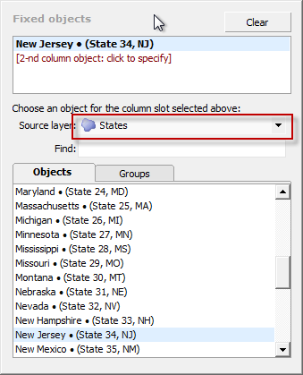
First, choose the fixed Column-three object
Choose New Jersey as the third-column fixed object by doing the following:
- Click in the "3rd-column: click to specify" area.
- Choose "States" from the "Source layer" dropdown.
- Scroll the "Objects" list down to New Jersey and click on it.
Your panel will appear as above.
Next, select the Carnegie Hall vicinity:
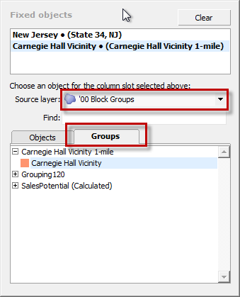
You can choose a fixed grouping on yet another layer
Choose the Carnegie Hall Vicinity area as the second-column fixed object by doing the following:
- Click in the "2rd-column: click to specify" area.
- Choose "'00 Block Groups" from the "Source layer" dropdown (first red rectangle, above). This is because you made your grouping on Block Groups.
- Click on the "Groups" tab (second red rectangle, above), and expand the grouping which contains the Carnegie Hall vicinity group, and select it.
Your panel will appear as above.
Finally, edit the title and subtitle, select the printer, and check the various output parameters.
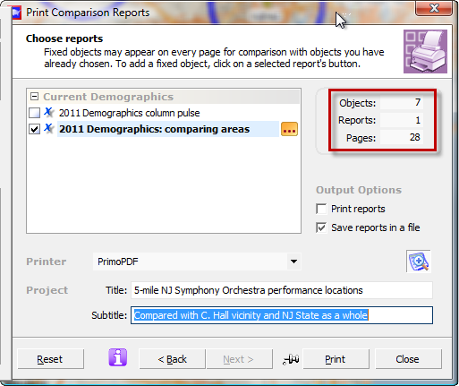
Last step: edit the title and subtitle
Before you click "Print", check the boxes which determine whether you will save to file, or Print, or both. Select your printer. Double-check the number of objects, reports, and pages you will generate. This is a four-page report, so with 7 objects it will end up being 28 pages.
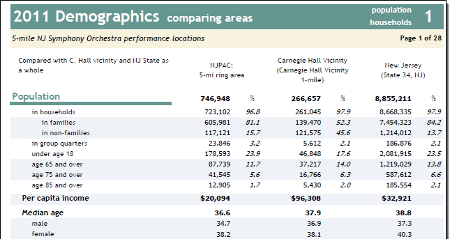
Sample page (first of 28)
This is the first page of the 7-areas comparison, and if you can finish reading it before you have lunch with your friend, you will be surprisingly well-informed.
If you do not fill out the "fixed" portions of the report, then Scan/US will fill in all three columns of the four-page report with five-mile rings from the original source, going three areas at a time, until all seven are taken care of. The report will be 12 pages, in that case. The readout will say that it is 28, because it is assuming you have used two fixed objects.
Benchmark report
Well, if that was a comparison report, what is a benchmark report? It is a "special case" of the comparison report, where it makes it easier for you to choose a "fixed object" as a benchmark. Also, Scan/US has a facility in Quicklook, for saving benchmarks. So, although this benchmark report "defaults" to a benchmark called "United States Summary," you can define your own benchmarks, and run them easly from this report.
The benchmark report is a report with two columns of data, with an additional column showing the "index" of the first column relative to the benchmark.

Get started by selecting "Print Benchmark reports" from the Report menu
Just as with the "Comparison" reports, you specify the objects for the reports. Here, using the same set of ring objects, we will specify just two of them using Object Manager:

Specify objects for report: shown above, using objects checked in Object manager
Click the button to the left of "Objet checked in the Object Manager" (red rectangle at left, above), and check the two sites for which you want reports (two red rectangles at right, above).
Notice that there are two similar lines for each site. One says "(site)", and one just says it is for the ring area. In this case, these two objects have the same values. But more-complicated ring area configurations can exist, with concentric rings, wedges, etc. Because of this possibly complexity, it's necessary to have a "site" object, that always has the total for the largest outermost ring. Those are the two that are checked, above.

Edit the title before printing
You can edit the title, before printing. Although there is a place to put in a subtitle, in the Benchmark report you will never see it.
Note the "dot-dot-dot" button, above (red circle), which is used to select a benchmark object different from the US Summary. If you do not select a different benchmark object, the US Summary will be used.
As before, note the number of objects and pages, so you get what you think you will be getting. And here, we have a PDF printer selected for output, so we aren't worried about a page count.
Click print, and your report will be produced:

Sample page showing location (red rectangle)
In every Scan/US site report, the latitude and longitude coodinates of the site (above red rectangle) will be shown. This is page 2 of a four-page report, with percentage columns showing a percentage of the total, the percent the value is of the benchmark, the benchmark count and percent of its total, and an index which can be used to compare the value in the ring area column with the value in the benchmark column.
Export data: all roster objects
What does it mean when you export data from the data menu, and select "All Roster objects?"

Export data
When you select Export data, the following dialog appears, with the current layer selected as the layer for export. You can pick a different layer as the source layer.

All roster objects means everything
When you choose "All roster objects" from the "layer roster" side of the dialog, you get all the objects. It's worth reflecting a moment on what this means. Notice that under "Total objects to export," it says 51 objects. This is the 48 states, plus Alaska, Hawaii, and the District of Columbia, but not including the U.S. territory of Puerto Rico. The "roster" includes objects from more than one study area, and exports data from them whether they are currently in view, or not.
This means that, at least at the US level, there are some layers you should not select, such as Blocks, or Traffic Counts (which cannot be exported in any case). However, you will be able to export Counties (3141), ZIP codes (41153 ZIPS), Census Tracts (65370), or even Block Groups (208729). MicroGrids do not give you the option of exporting all 2.5 million of them for the US, and the same is true of Z9 segments, of which there are about 45 million. These data containers are much much easier to use within Scan/Us.
Data-labeled maps
Normally, each object on a map can show the name, as below "GA" is the label for the state of Georgia. Scan/US has the option to show up to five data values as a label for each object. The Label Style selector can be activated either from the Tools Menu, by choosing "Label style..", or by clicking on the "AaBbCc" button in the Map Layers box, as shown below in left of the red rectangle. Notice that the checkbox next to "Object labels" (right side of red rectangle, below) must also be checked in order for labels to appear in the map

Either the tools menu or the "AaBbCc" button brings up the Label Style selector
When the Label Style selector appears, it has two tabs: "Format," and "Content." Format is for font style and size, label background, and control of the leader line connecting a label to the object which it labels. The Content tab is where you control the appearance of the 'object identifier' (usually its name, but, alternately, a code) or the data variables which you select.

Click the triangle (red circle above) to choose variables
When you click the data values radio button (red circle above), a menu expands to the right. Clicking into the first "choose variable to place" field will have the same effect: the first variable has been chosen from the list, and fills in this field:

Choose the first variable
In the image above the first variable has been selected from the list: "Average family size".
To get percentages, the white-hollowed-out triangle in the variable list was clicked to the the "%" sign underneath the variable, and then that was chosen.

Select percentages with the triangle
To select more variables, after the first one you must click onto the placeholder for the one you want to select:

Choose some other variables
Above, four variables have been entered: Average family size, average family income, and percent of housing units which are owned and rented.
Notice that when you click to the left of the variable in the 5-selected-variables list, you get the "[Enter tag]" prompt, and that is where you type in the caption you want to see.
When you are done, click "Apply" to see the data values in your map.

The resulting map shows the data variables for each object
In the resulting map, the data values are shown for each object. Notice the state name: this was added by adding a fifth variable: scrolling up through the lists of data lists to the top list, "US States Roster", and choosing "State name". Since variable list cannot be dynamically re-ordered, if you want the object name to appear in the more-normal top position, you must enter it first.
Also note that the '09 Place Centroids' layer has been hidden (by unchecking it), since the place names cause the automatic label placement to suppress the data-labels of the states. Another approach would be to activate manual label placement, to make sure the state labels show up.
These are map labels like any other labels, and you can move them around to reposition them in the map.